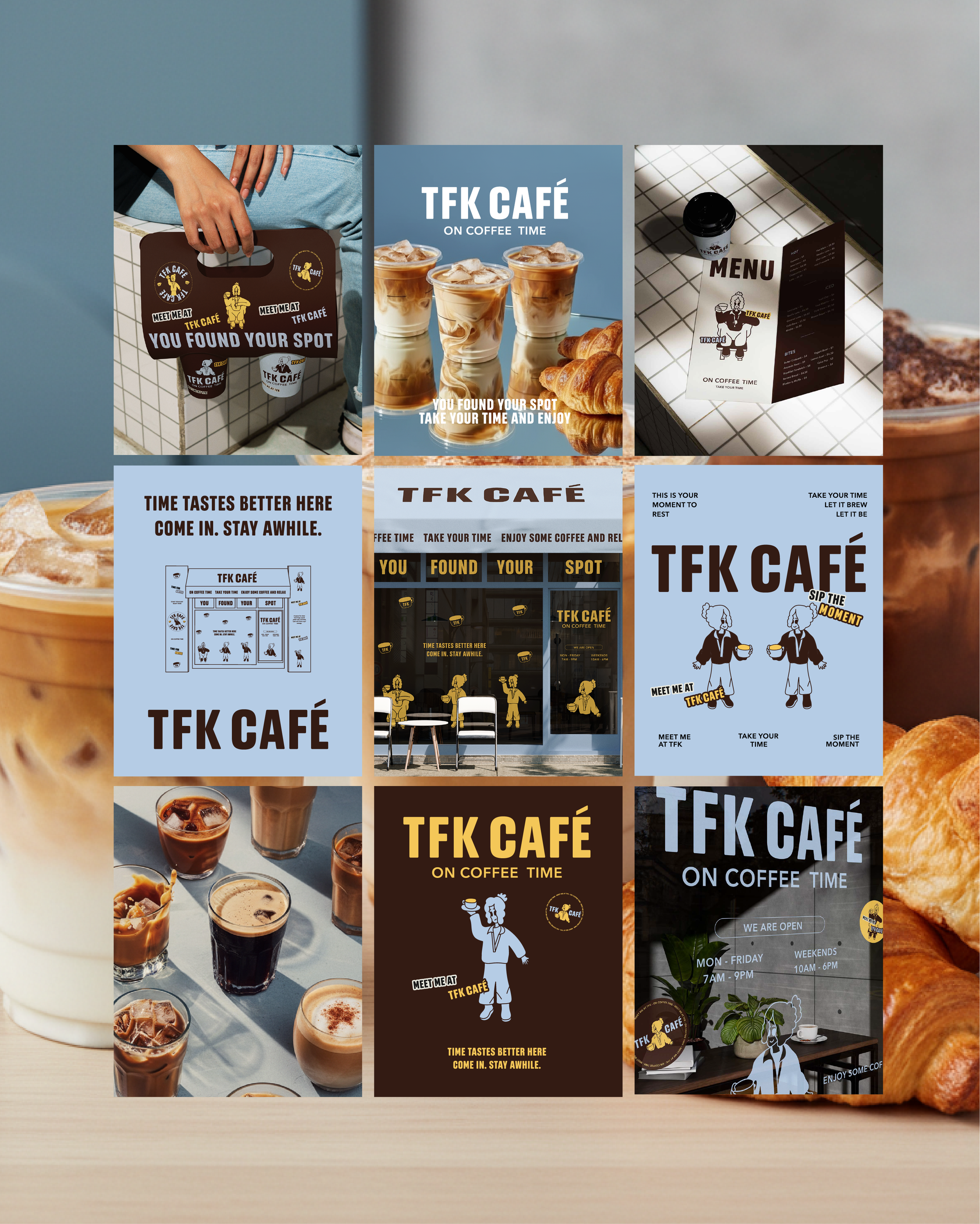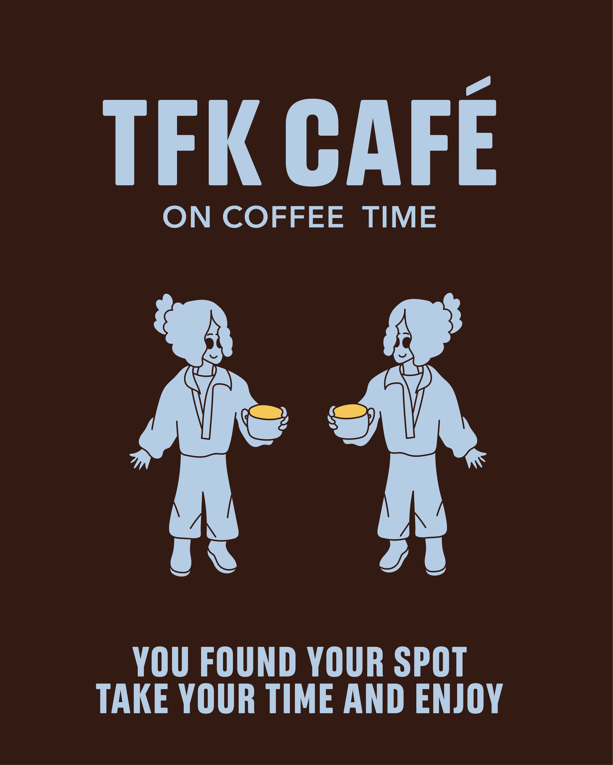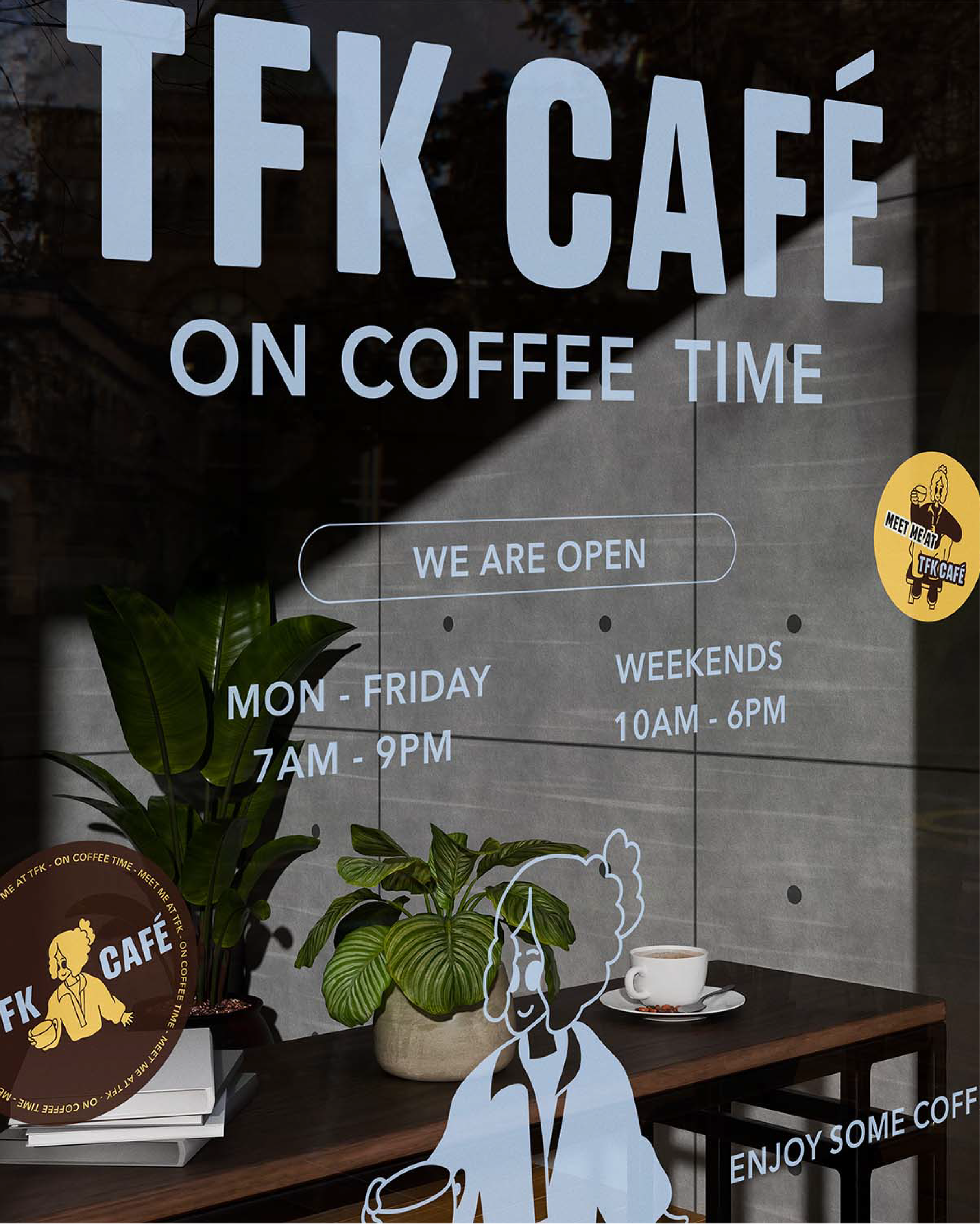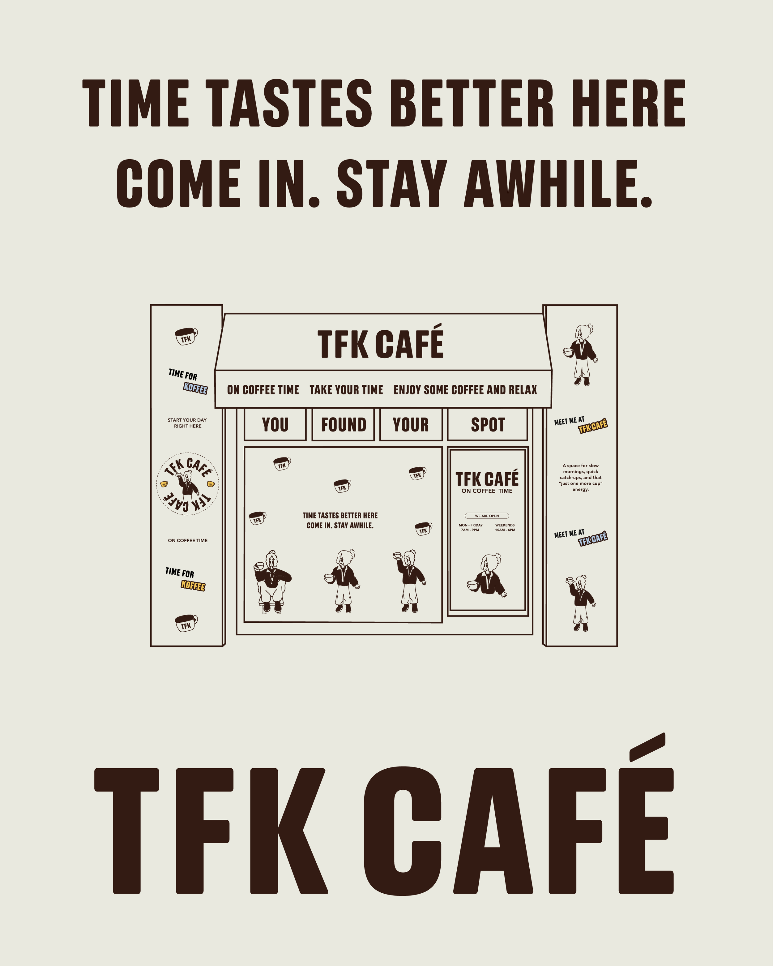
TFK CAFE
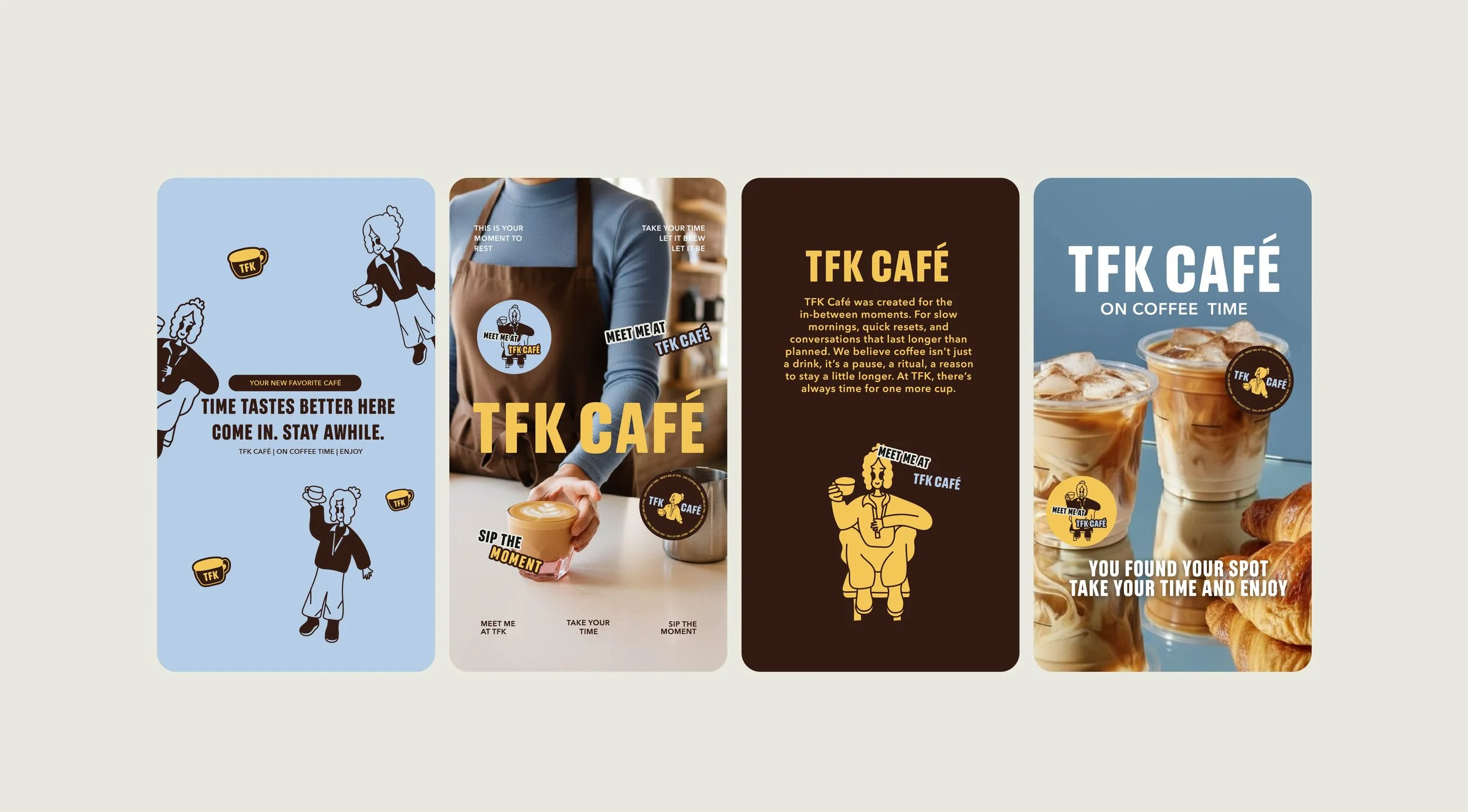
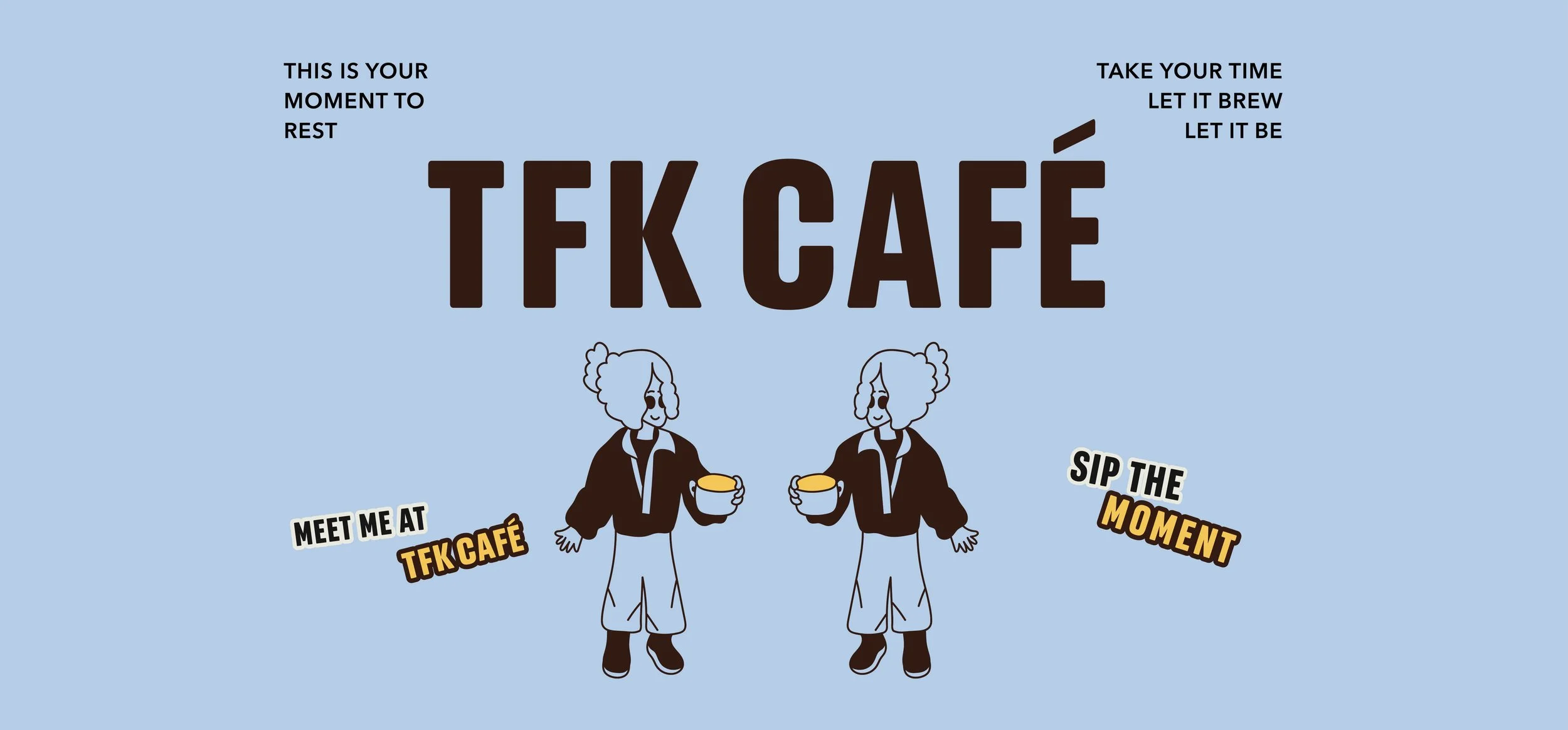
TFK Café was designed around that feeling. The idea of “On Coffee Time” turns coffee into more than just a drink, it becomes part of the moment. Coffee isn’t always about grabbing something quick and leaving. Sometimes it’s about slowing down, taking a break, and enjoying where you are.
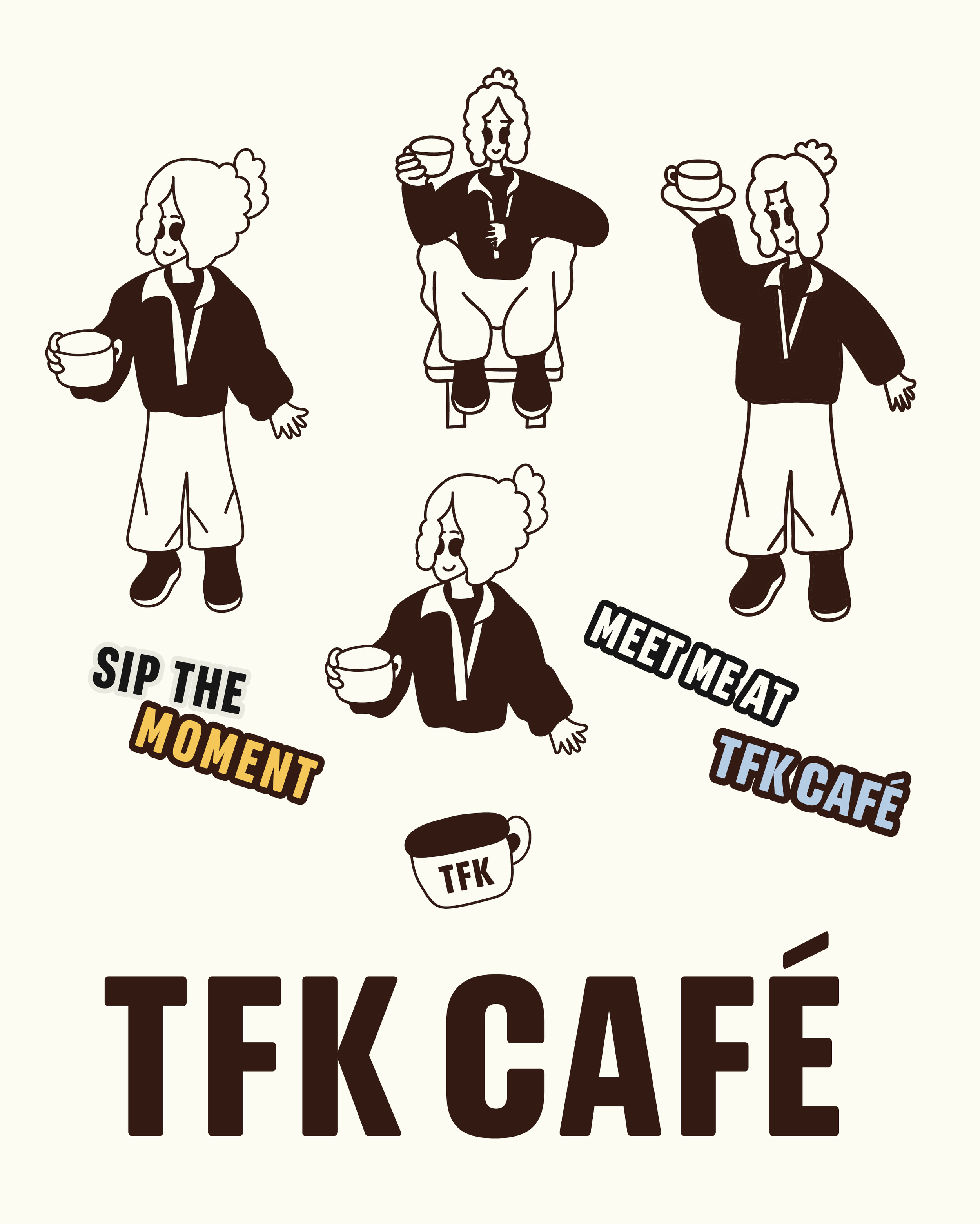
Bold typography gives the brand confidence, while playful illustrations add personality and make it feel more welcoming and human.TFK Café is about taking your time, staying a little longer, and enjoying the café, not just the coffee.
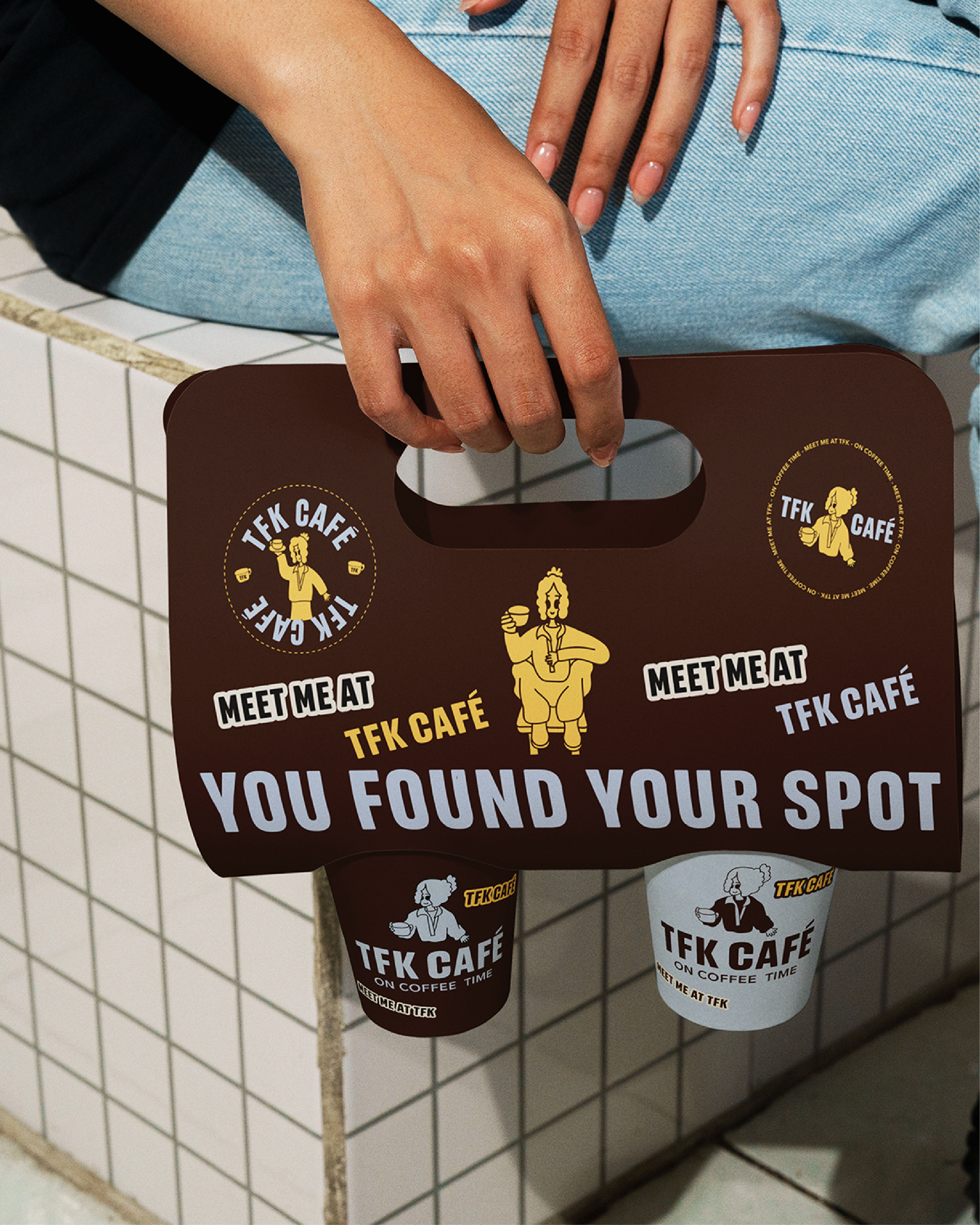
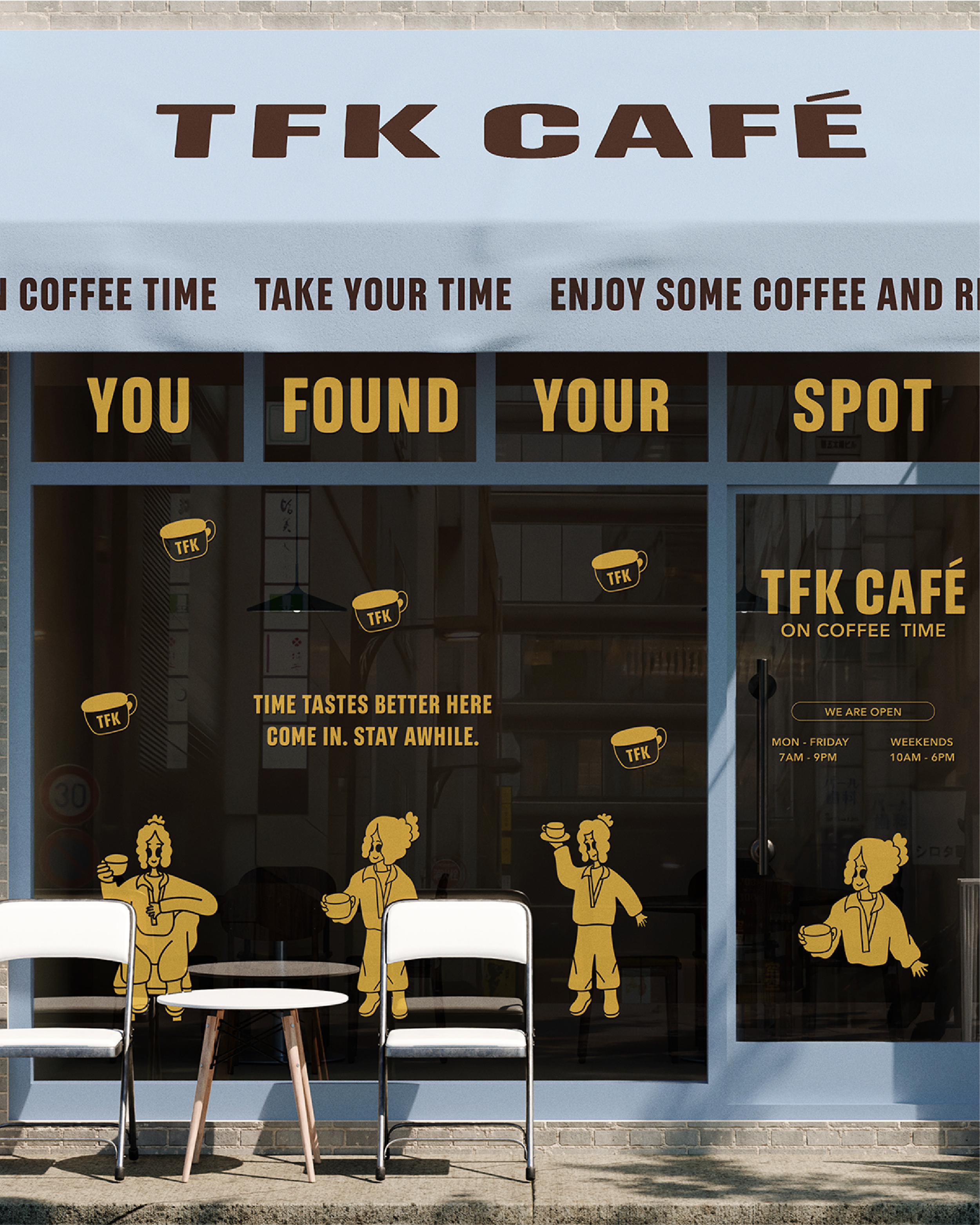

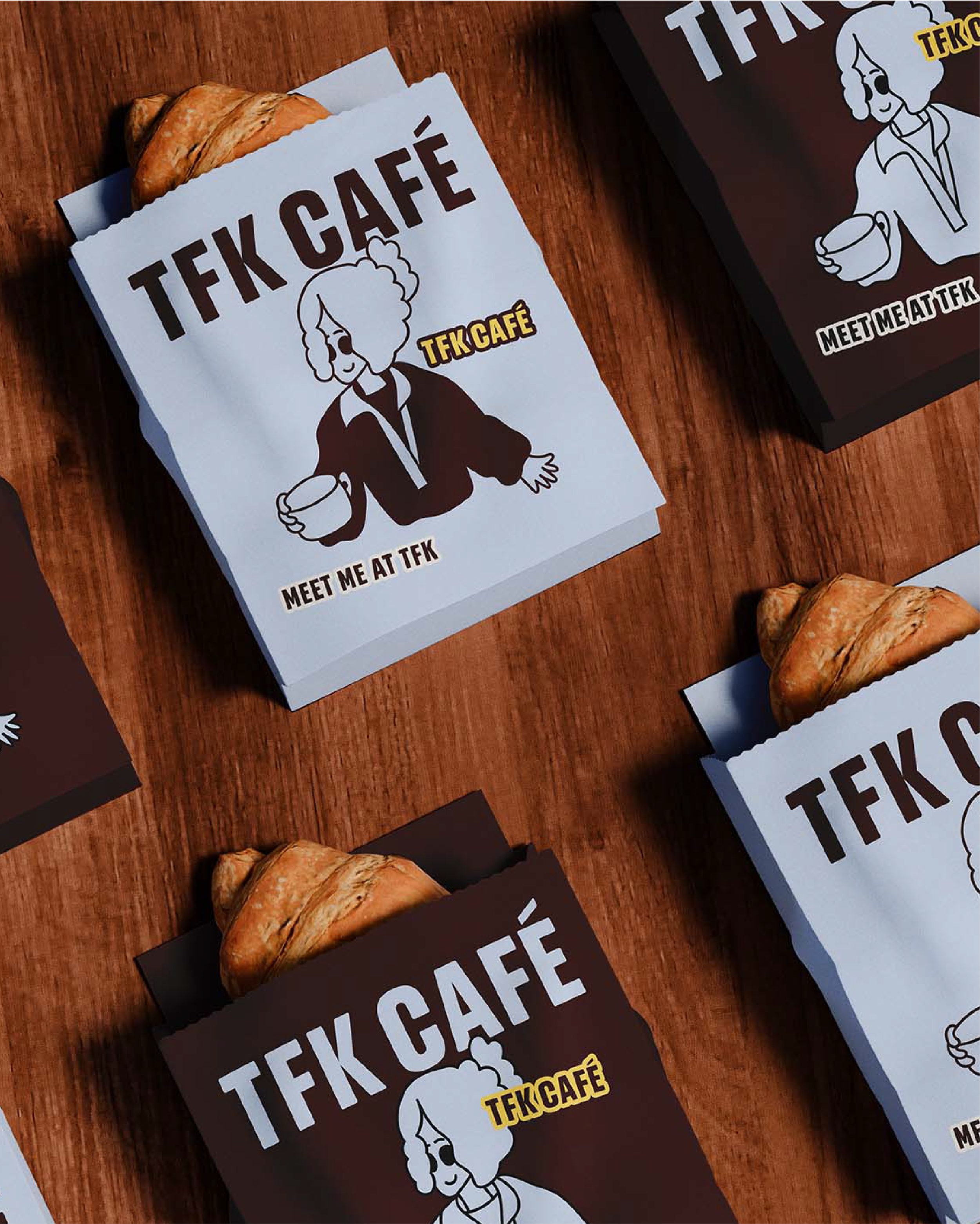
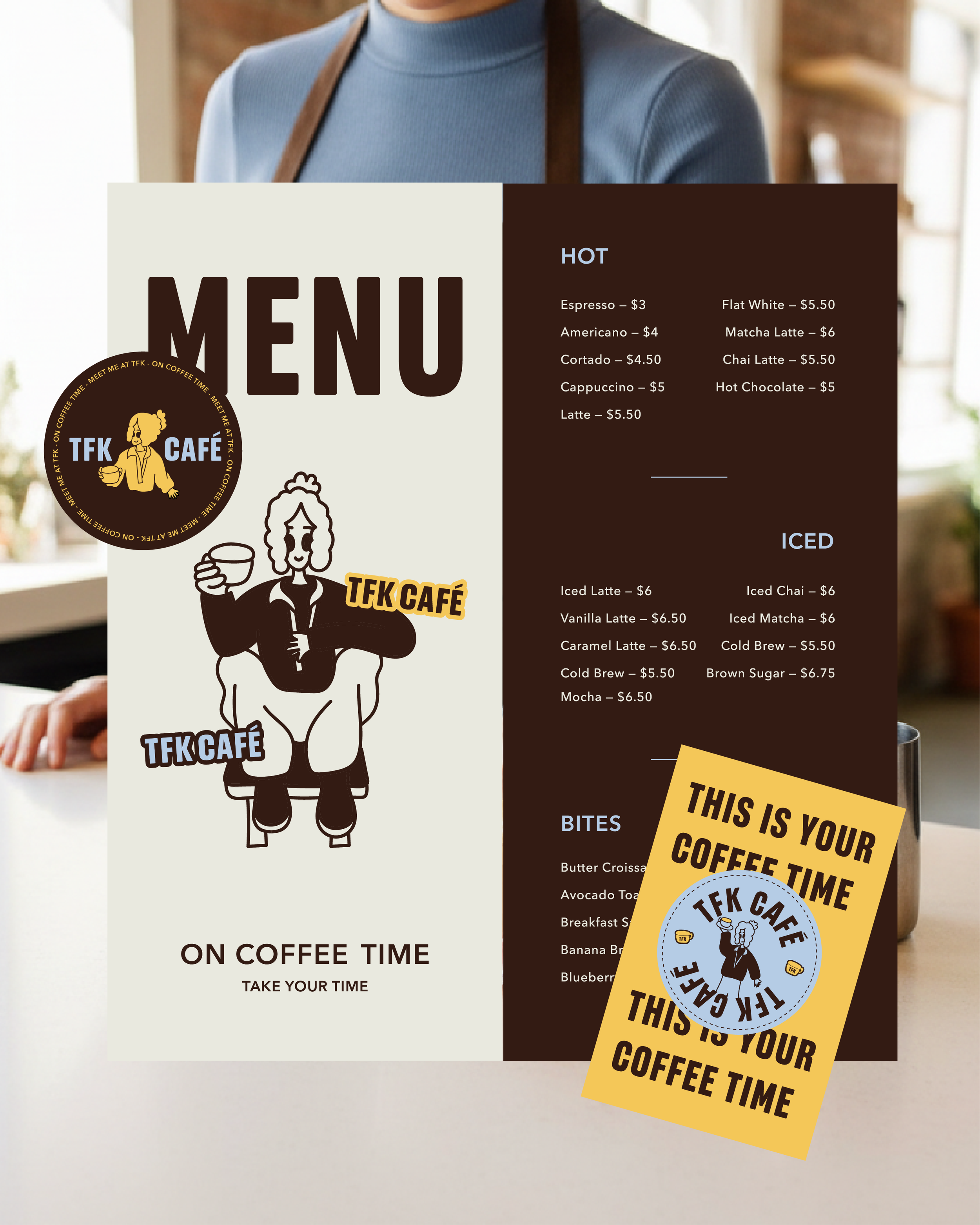
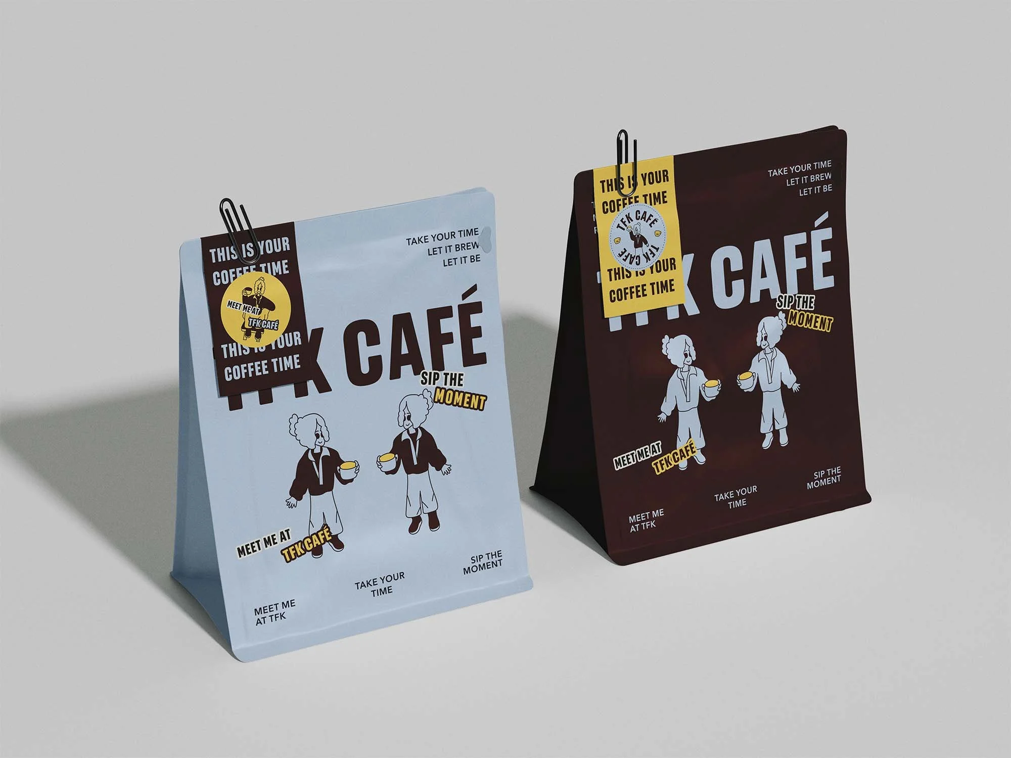
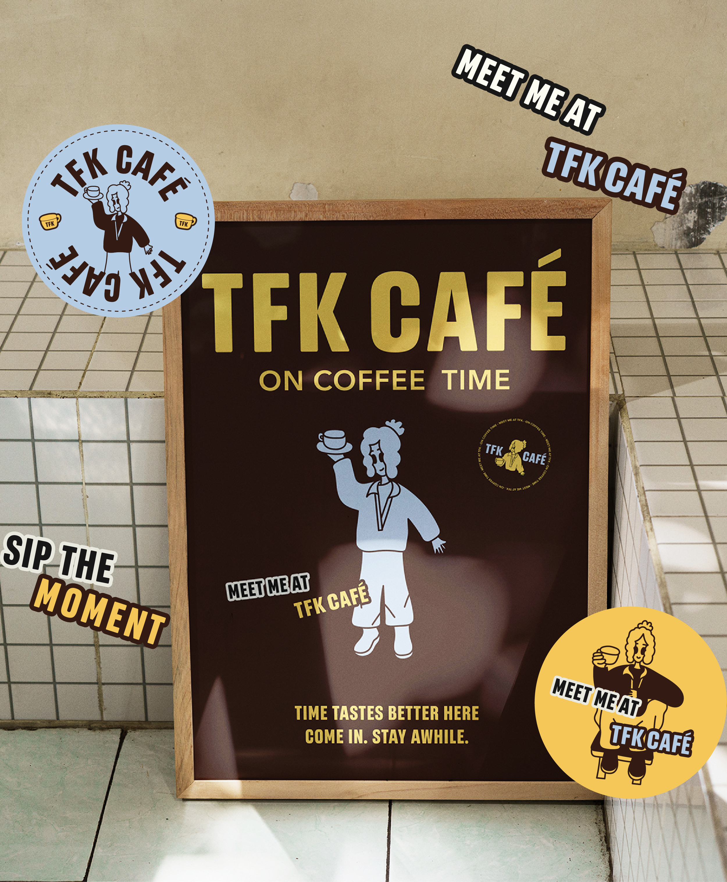
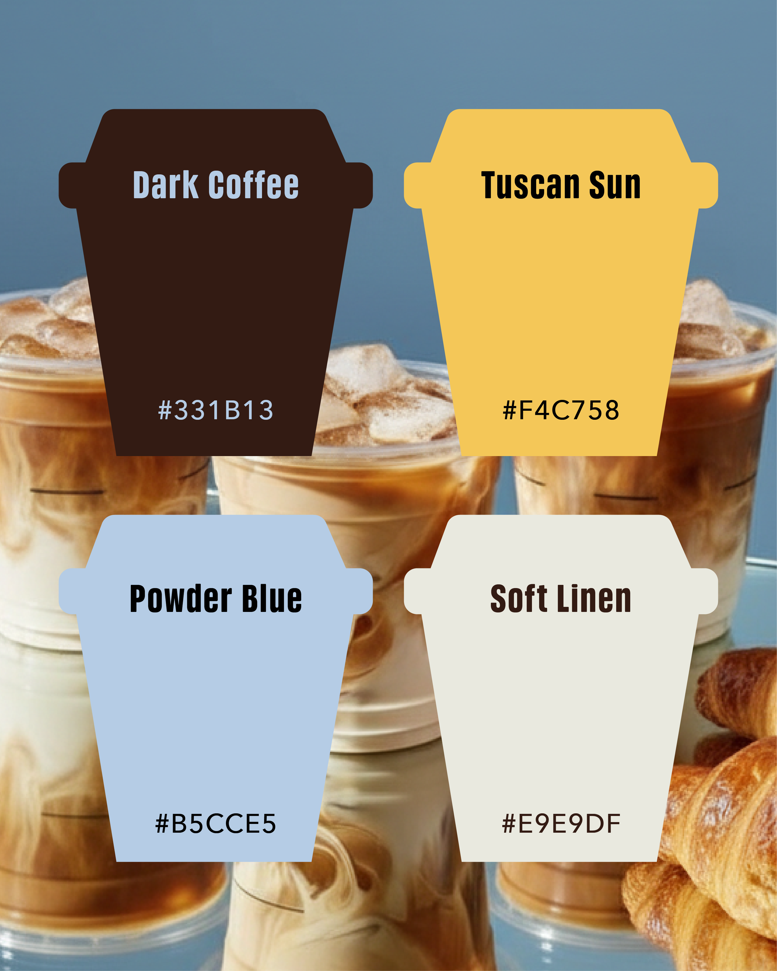
The visual direction combines rich brown tones with muted blue and warm yellow accents to create a balance between comfort and energy. Bold typography keeps the brand feeling confident and grounded, while playful illustrated characters bring warmth and personality across packaging, menus, loyalty cards, and in-store graphics. Every part of the brand was designed to feel welcoming, expressive, and memorable, encouraging people to slow down, stay a little longer, and enjoy the moment.